The main areas of ethical boundaries lie within;
- What is socially acceptable, meaning how far can we alter an image until we see it as wrong
- Copyright boundaries, meaning the limitations to what we can use as sources, etc.
For copyright there are limits to what an individual or group of people can use, and this falls under creative commons and their licencing terms, which are;
- Attribution -"This license lets others distribute, remix, tweak, and build upon your work, even commercially, as long as they credit you for the original creation. This is the most accommodating of licenses offered. Recommended for maximum dissemination and use of licensed materials."
- Attribution no derivatives - "This license allows for redistribution, commercial and non-commercial, as long as it is passed along unchanged and in whole, with credit to you."
- Attribution non commercial - share a like "This license lets others remix, tweak, and build upon your work non-commercially, as long as they credit you and license their new creations under the identical terms."
- Attribution share-alike - "This license lets others remix, tweak, and build upon your work even for commercial purposes, as long as they credit you and license their new creations under the identical terms. This license is often compared to “copyleft” free and open source software licenses. All new works based on yours will carry the same license, so any derivatives will also allow commercial use. This is the license used by Wikipedia, and is recommended for materials that would benefit from incorporating content from Wikipedia and similarly licensed projects."
- Attribution non commercial - "This license lets others remix, tweak, and build upon your work non-commercially, and although their new works must also acknowledge you and be non-commercial, they don’t have to license their derivative works on the same terms."
- Attribution non commercial no derivatives - "This license is the most restrictive of our six main licenses, only allowing others to download your works and share them with others as long as they credit you, but they can’t change them in any way or use them commercially."
Quotes taken from - http://creativecommons.org/licenses/
Although i would have to use specifically licenced works, i do not need to pick and choose, because i am a student and this falls under academic work so copyright law does not apply.
Sunday, 11 May 2014

Week 12 - DVD label finished

Overall, i find that the DVD label is by far the best part of the overall project, i feel that it reflects the Gears of war franchise perfectly, although there are a few downsides, such as;
- The xbox 360 segment to the disc looks sloppy, although i considered removing this section completely, just like i did with the DVD inlay, although i thought that the disc would look bare with it removed, so i kept it on
- The blood veins coming out of the Omen, i feel like i was on the right track but i went the wrong way with it, maybe if i had applied the same effects as i did with the Omen, it would have looked much better
- The font for the "Gears of war Emergence", this had totally slipped past me and i hadn't realised until too late that the font hadn't been changed, although it doesn't make a major difference i feel that it is slightly unfinished
Positive points;
- The template was implemented perfectly, and all ideas i had come up with in my head has been successfully transferred to the project
- The clipping masks work as i expected them to
- The omen itself is to my standards, perfect, mainly because of the applied effects such as the brush tool, and the additional photoshop added effects
- The postitioning of all of the objects are perfect and really reflect the franchise and its previous games
Techniques used;
- Clipping masks for the overall circlular shape of the disc, this was to keep any spill from the edges going into the white area which would be cut when printed, also a clipping mask was used for the BBFC logo for the same reasons
- Pen tool, this was used to create the catstick games logo, i felt that this tool did the job perfectly
- Transparencies, i used a transparent circle in which i used an inner text wrap to create the legal info on the disc
- Brush tool, i applied effects to the brush itself and added the effect over the omen, to give the effect of scratches, and again for the veins coming out from the omen (explained previously)
What i would do next time;
- Do more research into techniques, although the gears of war franchise disc art is more minimalist than fully worked on, i would look into learning how to make my own omen and apply effects
Tuesday, 6 May 2014
Week 12 - finished trailer
The finished version of the trailer is overall to a decent standard, overall i find that it is satisfactory.
The reasons why the video wasn't as good as it should have been;
- Certain transitions could have been explored more, meaning that i used to dip-to-black feature far too much and should have explored other techniques, for a more varied trailer to contrast different skills
- Around the 15th second there is a slight glitch in which it flashed an image, I had found no solution for this because i had tried to remake the clip but had some errors
- Around the 18-19th second the clip itself is too bright and the focus is taken away from the main point, next time i will change this and prevent it from happening
- Around the 47-54th second the clips transitions occur too fast, meaning that the effect of suspense isn't as prominent as if i would have made the transitions slightly further apart and slower, meaning the dip to black should have lasted longer
- Not enough variations in sound, there is only a backing track and one sound effect, although it is sufficient i feel that the trailer is not as good as it should've been mainly for this reason, next time i would add in sound effects of explosions and gun shots
- The ending, the ending is very sudden and i should have had it fade to black, the reason for this is that it transitions out peacefully to correspond with the music
Although the video has its bad points, there are some good points, such as;
- The transitions, although generic are smooth throughout the video and very little errors made
- Around the 20th second the clip effects really bring out the red in the scene and really keep the attention of the viewer
- The suitability of the music to the video, I find that the backing music goes well with the overall video, because of its depressing overtones
What i would do differently next time;
- Put more time into the trailer rather than focusing on the images, this is because i focused more on completing the photoshop and illustrator tasks because they are more challenging, meaning that less time was spent on premiere
- More sound effects, this is because the trailer itself is satisfactory, i think that with more sounds effects that the trailer will be more active and come to life
- More effects, i mainly used the dip-to-black, although it works well, i feel that there is room for improvement in this area, and if there was a next time i would definately pay more attention to effects
The reasons why the video wasn't as good as it should have been;
- Certain transitions could have been explored more, meaning that i used to dip-to-black feature far too much and should have explored other techniques, for a more varied trailer to contrast different skills
- Around the 15th second there is a slight glitch in which it flashed an image, I had found no solution for this because i had tried to remake the clip but had some errors
- Around the 18-19th second the clip itself is too bright and the focus is taken away from the main point, next time i will change this and prevent it from happening
- Around the 47-54th second the clips transitions occur too fast, meaning that the effect of suspense isn't as prominent as if i would have made the transitions slightly further apart and slower, meaning the dip to black should have lasted longer
- Not enough variations in sound, there is only a backing track and one sound effect, although it is sufficient i feel that the trailer is not as good as it should've been mainly for this reason, next time i would add in sound effects of explosions and gun shots
- The ending, the ending is very sudden and i should have had it fade to black, the reason for this is that it transitions out peacefully to correspond with the music
Although the video has its bad points, there are some good points, such as;
- The transitions, although generic are smooth throughout the video and very little errors made
- Around the 20th second the clip effects really bring out the red in the scene and really keep the attention of the viewer
- The suitability of the music to the video, I find that the backing music goes well with the overall video, because of its depressing overtones
What i would do differently next time;
- Put more time into the trailer rather than focusing on the images, this is because i focused more on completing the photoshop and illustrator tasks because they are more challenging, meaning that less time was spent on premiere
- More sound effects, this is because the trailer itself is satisfactory, i think that with more sounds effects that the trailer will be more active and come to life
- More effects, i mainly used the dip-to-black, although it works well, i feel that there is room for improvement in this area, and if there was a next time i would definately pay more attention to effects
Tuesday, 29 April 2014
Week 12 - Finished DVD inlay

The finished version of the DVD inlay for Gears of war : Emergence.
Overall i find that the back cover and spine are near perfect (to my standards at least), but the front cover could have been done far better the reasons for this are;
- It makes no sense, this is because there is a fair amount happening and that the focus isn't precise, as with most other covers
- The quality overall of the image isn't terrible, although there are jagged edges to the imported images/ layers, such as the "Corpser" (Spider) has some jagged edges
- The cutout of the city, i used a previous project in which i had cutout a city beforehand, i decided this to be better than a single building, this isn't a perfect cutout and i have done this do the best of my ability
Positive points to the front cover;
- The red silouette is fantastic, if i were to recreate this image, i would definately do this part the same mainly because it goes with the theme overall of gears of war and fans of the series can identify the character
- The juxtaposition of the calm lake next to the dying city, i did this mainly to create a sense of emergency and a sudden catastrophy
- The models (flying), i used concept art and pictures of toys to create these parts, because they aren't taken from a video game, there is a sense of realism about them- especially since they are miniature
Overall success of design to implementation was fairly successful, especially the spine and back cover, again the front cover was changed for reasons i will mention next.
The differences with design;
- BBFC logos, i decided to remove them from the spine and front cover mainly because i felt it wasn't necessary because we were tasked with creating the cover itself, although i have included it on the back to give the overall cover a sense of realism
- Xbox 360 cover design, i had changed my design (in my head) and included it in my draft, i later decided that it affected the overall quality of the image and decided not to include it- the reason it affected the quality is that it limited my image size, in which i needed a fair amount and the fact that i personally prefer it the way it is now
Overall i kept to the design, keeping predicted images in the same area, same with titles and legal info.
In the end i decided to change the image for the front cover (from the single building to the city) because i felt that the wasn't much possibility for exploring potential skills with the single building because the image was already filled with this building, i felt that switching to the city gave me the space i need to add in other images and explore potential.
If i were to do this project again next time, i would change the front cover mainly because i am unhappy with it currently, the reason for this has been mentioned previously, although next time i will definately do more research into the subject and look into other peoples work and see what i can learn from that, although i explored the overall tools, etc, i feel that research would have benefitted me far more than what i have done.
Although i feel that the spine and back cover are good, next time i will research into making it more production level quality, as with the front cover.
Techniques used;
- Effects, i gave an outer glow to the city and the title text to make it stand out more against the black background, i felt this was necessary because otherwise the city would blend in with the background and be hard to see, i also gave the "marcus" layer a red overlay to create that 2d flat silouette effect.
- Levels, i used this on the back cover for an image, and on the front to bring out the red darkness, as i was trying to get red of the slight blue overtone to the city, as the image was taken during daytime
- Layer mask (Brighness and contrast), i also used the pen tool to outline the city, in which i made a layer mask, and transferred it over to the B&C, i did this as stated before to remove the blue/ light overtone to the city
- Opacity, i had gotten a dust texture for the image, and decided to use that to filter the black background to give the effect of smoke, i felt this was necessary because it brought the focus from the reader forward
- Basic tools, such as selection, placement, magic wand tool (to remove white parts of an image)
- I have included an outside image on the disk, i felt this was necessary as some work went into it and was included in the finished product overall, i have used levels and effects to alter the image, this image has been altered twice (once for back and spine) in which i would edit the settings for certain parts and then import
- Filter, i have decided to use a blur filter on some of the "Reavers" (flying monsters), mainly because i wanted to give the effect that they were party in the smoke of the background, just to give it a sense of distance and to try and avoid a flat image
Tuesday, 8 April 2014
Week 10 - Trailer
So far for the trailer I have compiled clips from other existing media, noted in previous blogs, and i have applied visual effects to them, I have also added a black colour matte and added in my logo to stretch in and fade out at the start.
The effects I have used currently;
Time echo - this is to bring out certain effects such as blood spatter and explosions after the second title, I want to draw the attention to the bright colours to give a contrast from all over the video and glorify some of the game's potential effects
Fade out - I have used this to apply an effect to my logo on the startup on the video so it transitions onto the next clip more smoothly and gives the effect to the watcher that it's happening quickly
Dip to black - I have used this to transition between titles so it isn't a solid transition, which give the impression that the work itself isn't of a good quality
The effects I have used currently;
Time echo - this is to bring out certain effects such as blood spatter and explosions after the second title, I want to draw the attention to the bright colours to give a contrast from all over the video and glorify some of the game's potential effects
Fade out - I have used this to apply an effect to my logo on the startup on the video so it transitions onto the next clip more smoothly and gives the effect to the watcher that it's happening quickly
Dip to black - I have used this to transition between titles so it isn't a solid transition, which give the impression that the work itself isn't of a good quality
Thursday, 3 April 2014
Week 9 - Premiere
For my trailer I have chosen to use 30 FPS, AVCHD 720P, mainly because of the source footage (gameplay and trailers) are set to 30 FPS and having the main project set to that will make it look smoother.
I chose AVCHD 720P because of the video format, it will be easier to export and import files whilst maintaining a fairly high quality for the project.
It is also set to DV for the standard for video editing, it is also in widescreen so that most machines can view it without the black space.
My source footage (taken from youtube);
https://www.youtube.com/watch?v=twYqFHMXI7w
https://www.youtube.com/watch?v=hYiij5EW1RM
https://www.youtube.com/watch?v=uiHY91AcG9E
https://www.youtube.com/watch?v=JUnpLYE_ei8
Not all of these may be used for the trailer, but i do intend to have as much footage as possible while maintaining high quality.
For the tools i do intend to import my logo as an image and create a black matte background and add some possible effect to the logo as the trailer starts, and have a fade for the logo as well onto some footage.
I also intend to use the array of tools at my disposal.
I chose AVCHD 720P because of the video format, it will be easier to export and import files whilst maintaining a fairly high quality for the project.
It is also set to DV for the standard for video editing, it is also in widescreen so that most machines can view it without the black space.
My source footage (taken from youtube);
https://www.youtube.com/watch?v=twYqFHMXI7w
https://www.youtube.com/watch?v=hYiij5EW1RM
https://www.youtube.com/watch?v=uiHY91AcG9E
https://www.youtube.com/watch?v=JUnpLYE_ei8
Not all of these may be used for the trailer, but i do intend to have as much footage as possible while maintaining high quality.
For the tools i do intend to import my logo as an image and create a black matte background and add some possible effect to the logo as the trailer starts, and have a fade for the logo as well onto some footage.
I also intend to use the array of tools at my disposal.
Tuesday, 18 March 2014
Week 7 - Premiere
Today in lesson we were introduced to Premiere, a video editing software.
The techniques we learnt are;
Selection tool (this allows you to select certain clips for the overall video)
Track select (allows you to position clips)
Ripple edit (allows you to set the time allocated for a clip, e.g. if it's 30 frames long and you set it to 0.5s at 30fps it will play at double the rate)
Rolling edit (alloes you to allocate certain times in which the video starts playing)
Rate stretch
Razor (Lets you cut a section off of the selected clip)
Slip
Slide
Pen (allows you to set contrast levels and pitch levels and can be changed using the CTRL key for the gradient of the fade in, fade out)
All of these tools will be useful in making my trailer.
Brainstorming for ideas;
Black and white with "mad world" playing with clips from the other gears of war games.
The techniques we learnt are;
Selection tool (this allows you to select certain clips for the overall video)
Track select (allows you to position clips)
Ripple edit (allows you to set the time allocated for a clip, e.g. if it's 30 frames long and you set it to 0.5s at 30fps it will play at double the rate)
Rolling edit (alloes you to allocate certain times in which the video starts playing)
Rate stretch
Razor (Lets you cut a section off of the selected clip)
Slip
Slide
Pen (allows you to set contrast levels and pitch levels and can be changed using the CTRL key for the gradient of the fade in, fade out)
All of these tools will be useful in making my trailer.
Brainstorming for ideas;
Black and white with "mad world" playing with clips from the other gears of war games.
Thursday, 13 March 2014
Week 6 - Back cover
This is my currently finished back cover, i decided to go for a block red for the blood, as recommended by others, i have also aligned the screenshots in a more presentable manner, and also changed the Levels of the second screenshot to make it slightly darker to fit in with the other images.

Week 6 - back cover
So far for my back cover, I have taken this image (the one below) and used the magic wand tool to isolate the whites on the image and to create a new layer to mask over it, and changed the white to black.
I have also used opacity on the original image to fade the reds slightly, but because of the mask the whites aren't affected anyways, I have also created a black background using a vector shape (square) and made it black just so the red isn't transparent on white (on paper, even though the background is transparent).

.png)
I have also used opacity on the original image to fade the reds slightly, but because of the mask the whites aren't affected anyways, I have also created a black background using a vector shape (square) and made it black just so the red isn't transparent on white (on paper, even though the background is transparent).
Image i have used
Hue/saturation 2 is the mask over the image, black rectangle to prevent any background overfill.
Tuesday, 11 March 2014
Week 6 - Own work
I decided to look up a tutorial on how to draw veins, to add the effect coming from the omen.
http://design.tutsplus.com/tutorials/how-to-create-a-spooky-eyeball-with-veins-in-adobe-illustrator--vector-16815
I only used part 3 of the tutorial to complete the veins for the image.

http://design.tutsplus.com/tutorials/how-to-create-a-spooky-eyeball-with-veins-in-adobe-illustrator--vector-16815
I only used part 3 of the tutorial to complete the veins for the image.
Monday, 10 March 2014
Week 6 - Progress (DVD inlay)
I have completed a draft for the DVD inlay, this isn't the final image and is open to major alterations.
Front cover;
used texture filter
removed cars using patch tool (trying to keep as much realism as possible, will change street itself into ruins)
spot healing brush for cars as well
added helos (for authenticity)
added in giant mega death ray (hammer of dawn)
changed contrast and brightness (main city image)
Back cover;
I imported images (screenshots)
Used magic brush tool to isolate whites and create a layer mask for the blood texture to turn the white to black
Changed opacity slightly to relieve the strongness of the red
Front cover images used;
http://blog.condooutlet.com/Portals/39212/images/imperial%20plaza.jpg
http://news.toyark.com/wp-content/uploads/sites/4/2012/09/Erector-Gears-Of-War-King-Raven-04_1347050402.jpg
http://img2.wikia.nocookie.net/__cb20090827070929/gearsofwar/images/b/bf/End_of_ez_world.png
Back cover images used;
http://d15uu3l1sro2ln.cloudfront.net/wp-content/uploads/2009/05/gears-of-war-2-screenshot-91-1024x576.jpg
http://s.pro-gmedia.com/videogamer/media/images/xbox360/gears_of_war_3/screens/gears_of_war_3_97.jpg
http://www.gameinformer.com/cfs-filesystemfile.ashx/__key/CommunityServer-Discussions-Components-Files/12/5516.gears_2D00_of_2D00_war_2D00_2_2D00_screenshot_2D00_3.jpg
http://lebstock.deviantart.com/art/the-gate-part-1-23216111

Front cover;
used texture filter
removed cars using patch tool (trying to keep as much realism as possible, will change street itself into ruins)
spot healing brush for cars as well
added helos (for authenticity)
added in giant mega death ray (hammer of dawn)
changed contrast and brightness (main city image)
Back cover;
I imported images (screenshots)
Used magic brush tool to isolate whites and create a layer mask for the blood texture to turn the white to black
Changed opacity slightly to relieve the strongness of the red
Front cover images used;
http://blog.condooutlet.com/Portals/39212/images/imperial%20plaza.jpg
http://news.toyark.com/wp-content/uploads/sites/4/2012/09/Erector-Gears-Of-War-King-Raven-04_1347050402.jpg
http://img2.wikia.nocookie.net/__cb20090827070929/gearsofwar/images/b/bf/End_of_ez_world.png
Back cover images used;
http://d15uu3l1sro2ln.cloudfront.net/wp-content/uploads/2009/05/gears-of-war-2-screenshot-91-1024x576.jpg
http://s.pro-gmedia.com/videogamer/media/images/xbox360/gears_of_war_3/screens/gears_of_war_3_97.jpg
http://www.gameinformer.com/cfs-filesystemfile.ashx/__key/CommunityServer-Discussions-Components-Files/12/5516.gears_2D00_of_2D00_war_2D00_2_2D00_screenshot_2D00_3.jpg
http://lebstock.deviantart.com/art/the-gate-part-1-23216111
Thursday, 6 March 2014
Week 5 - DVD label
I have added to my draft, a clipping mask so the edges over the bleed are gone, i have also done this for the BBFC symbol so any chance of overspill is gone, I have also used the paintbrush to add an effect on the Omen (scratches), I have also used a transparent circle to add a text wrap to the inner part of it to add legal disclaimers (currently lorem ipsum).

Add in the white section at the top for the xbox 360 logo for consistency.
Change the lorem ipsem to proper text.
Change the font of the Gears of war : Emergence, and use editing to make it more unique.
Change the font for the Catstick Games.
Optional objectives;
Recreate the xbox 360 logo to remove pixellation
Recreate omen (although it's already as good as possible, it would be more worthwhile to do so, to pick up extra marks for the assignment)
After the main things have been completed my work will be shifted to the DVD inlay, and possibly the optional objectives side to the label.
Tuesday, 4 March 2014
Week 5 - Logo
This is the draft image for my company logo, this will be featured on my DVD label and DVD cover inlay.

I used the pen tool to create this from scratch, also used vector based rectangles for the colours, i have also added the border to add the effect of rust, i did this because i felt it was necessary to keep as much in common with the gears of war franchise as possible.
I have also used to text tool for the name "Catstick games" - this will later be changed to another font.
I also decided to have it mainly in white for the black background of the DVD label, but this may change for the DVD inlay.
Week 5 - Progression
So far i have completed a draft of the DVD label (not final version) and completed the draft of my company logo.


The draft of my DVD label.
The image i used for the disc label, I have photoshopped it to a black and white image using the black and white tool, I also added an outer glow (white) so it would be more noticeable on the label.
The image i used for the xbox 360 logo at the top of the disc, i just moved it over, i decided to add in the xbox 360 label to make it more believable and as an excuse to add in an image.
The image i used for the age rating, i decided to do this again to make it more believable and to use the Britsh version again to make it believable.
Thursday, 27 February 2014
Week 4 - DVD label template
So far i have created my template according to the image below, the website has been linked, I believe these to be sufficient guides for the disc label with decent diameters and bleed areas.
I will be creating my disc label around the stack ring with a likely black area or faded area for the cutout parts.
As always the colour from the disc label will bleed into the bleed areas.

Tuesday, 25 February 2014
Week 4 - Brainstorming DVD label
The current idea I have for my company logo is similar to the Epic games logo, except with a few additions, such as a box above the 6 sided shape for a name, and a chevron type part underneath.
The ideas i have for the name of the company are;
Not-so-Epic games
Gears of war
Badass games

Although the placement on the cover itself will be minimal (small size) I will be putting a fair amount of effort in creating it.
I will also be probably following the style of the previous Gears of war games for the DVD label itself, with the skull recreated using vector graphics (illustrator).
I have also decided that because this is a franchise owned by microsoft and published for the Xbox consoles, that i will include their logos for the disc and DVD inlay, as it would be for any standard game, the vector image will be created by me personally and the company logo.
Next blog post will have my logo template and further ideas for the DVD label.
The ideas i have for the name of the company are;
Not-so-Epic games
Gears of war
Badass games
Although the placement on the cover itself will be minimal (small size) I will be putting a fair amount of effort in creating it.
I will also be probably following the style of the previous Gears of war games for the DVD label itself, with the skull recreated using vector graphics (illustrator).
I have also decided that because this is a franchise owned by microsoft and published for the Xbox consoles, that i will include their logos for the disc and DVD inlay, as it would be for any standard game, the vector image will be created by me personally and the company logo.
Next blog post will have my logo template and further ideas for the DVD label.
Sunday, 23 February 2014
Week 3 - Font
I managed to get a hold of the font that will be used for the title themes and blurb, rather than me compiling already existing texts and images, this will be much, much easier.
http://www.dafont.com/cgf-locust-resistance.font
Credit goes to Chris Garret.
http://www.dafont.com/cgf-locust-resistance.font
Credit goes to Chris Garret.
Week 3 - Planning
I have decided to do my assignment based on the Gears of war franchise, and have come up with a mock template as to where certain things go, i will explain as to where everything is intended to go and explain how i intend to create the overall document.

Although it doesn't look like much, this is an outline for what's to come.
To the right there is the front cover with the white box to the front, this is for the title, the title itself will be Gears of war : Emergence, I will look up a font for this so it will be more believable and be more relatable to the other games in the franchise, the colours of the title will be white for the Gears of war : part, but red for the Emergence part.
The square red box is the position for the PEGI rating for the game, again to make it more believable.
The grey overall for the front cover is for the main image, I am creating this image in a separate file because i don't want any filters or modifications to spill over into the other parts of the overall image, and to make it easier.
The black background for the spine will be the background, possible with a dusty type filter to add the effect of hardship or setting the tone for the target audience.
The red top part for the spine is the placement for the crimson omen (the skull picture shown in previous blogs), and that will merge with the white box, which is the text for the spine and will follow the same colour code and the title for the front cover.
The red box at the bottom of the spine is for the PEGI rating.
The red section atop the back cover is the placement of a bloodstain type background, over text that details the game, the blurb, this will be similar to the other gears of war games and also similar to the Dead rising series as well.
The white section in the center of the back cover is the placement for screen shots, i will be making these from already made screenshots and editing them using the tools available.
The black part at the bottom is the part for the legal disclaimers, etc. plus a logo and the same style as the top part and the spine.
I will be creating the back cover first because i see this as the easiest part and i want to get it out of the way easily.
Although it doesn't look like much, this is an outline for what's to come.
To the right there is the front cover with the white box to the front, this is for the title, the title itself will be Gears of war : Emergence, I will look up a font for this so it will be more believable and be more relatable to the other games in the franchise, the colours of the title will be white for the Gears of war : part, but red for the Emergence part.
The square red box is the position for the PEGI rating for the game, again to make it more believable.
The grey overall for the front cover is for the main image, I am creating this image in a separate file because i don't want any filters or modifications to spill over into the other parts of the overall image, and to make it easier.
The black background for the spine will be the background, possible with a dusty type filter to add the effect of hardship or setting the tone for the target audience.
The red top part for the spine is the placement for the crimson omen (the skull picture shown in previous blogs), and that will merge with the white box, which is the text for the spine and will follow the same colour code and the title for the front cover.
The red box at the bottom of the spine is for the PEGI rating.
The red section atop the back cover is the placement of a bloodstain type background, over text that details the game, the blurb, this will be similar to the other gears of war games and also similar to the Dead rising series as well.
The white section in the center of the back cover is the placement for screen shots, i will be making these from already made screenshots and editing them using the tools available.
The black part at the bottom is the part for the legal disclaimers, etc. plus a logo and the same style as the top part and the spine.
I will be creating the back cover first because i see this as the easiest part and i want to get it out of the way easily.
Thursday, 13 February 2014
Week 2 - Final ideas for the end cover
Decision ;
I have decided to either do Star wars : Episode VII or a videogame based on the Gears of war franchise, the reason for this is that i both enjoy each of the franchises and each have massive opportunity in different areas, such as star wars for the photoshop section and gears of war for the trailer section.
Both franchises have many different contrasts, dark and light and a lot of potential to use all tools possible for the assignment.
Overall I am leaning towards Gears of war for the overall assignment, but I will plan for both up until i start the assignment.
Star wars
Ideas;
Below are the possible ideas i have for the DVD cover case, these are existing images and will be referenced

http://www.yosemite-sam.net/images/Star-Wars-Blu-ray-covers-wanted.jpg
I am considering a possible front cover similar to these to keep the recurring theme between the films going, although I might go for something completely different and have a shot of a planet with a lot of broken up ships over it, possibly with a figure over the top possibly of the antagonist, maybe a different rendition of darth vader for the figure, kind of similar to a shadowy silouette as opposed to the image above, here are some possible ideas for the figure in the background.


For the first image, i am considering taking out darth vader and editing him so the colours are different, mainly because he is dead in the 6th episode i and i want the audience to think instantly that this is a clone or not darth vader at all, i am also considering changing the lighting reflecting off of him because the image i am trying to portray is a dark, mysterious silouette.
For the second image, i am also intending to change the lighting to give off a certain message, this image is most likely to be edited into the final image mainly because this isn't a character in the main films, and only a character in video games which his role has not been explained properly past the previous game he was in, so storyline-wise this would be the best choice.
Gears of war
Ideas ;
Below are the ideas i think i should follow if i want to create this inlay.


I have decided to either do Star wars : Episode VII or a videogame based on the Gears of war franchise, the reason for this is that i both enjoy each of the franchises and each have massive opportunity in different areas, such as star wars for the photoshop section and gears of war for the trailer section.
Both franchises have many different contrasts, dark and light and a lot of potential to use all tools possible for the assignment.
Overall I am leaning towards Gears of war for the overall assignment, but I will plan for both up until i start the assignment.
Star wars
Ideas;
Below are the possible ideas i have for the DVD cover case, these are existing images and will be referenced
http://www.yosemite-sam.net/images/Star-Wars-Blu-ray-covers-wanted.jpg

I am considering a possible front cover similar to these to keep the recurring theme between the films going, although I might go for something completely different and have a shot of a planet with a lot of broken up ships over it, possibly with a figure over the top possibly of the antagonist, maybe a different rendition of darth vader for the figure, kind of similar to a shadowy silouette as opposed to the image above, here are some possible ideas for the figure in the background.


For the first image, i am considering taking out darth vader and editing him so the colours are different, mainly because he is dead in the 6th episode i and i want the audience to think instantly that this is a clone or not darth vader at all, i am also considering changing the lighting reflecting off of him because the image i am trying to portray is a dark, mysterious silouette.
For the second image, i am also intending to change the lighting to give off a certain message, this image is most likely to be edited into the final image mainly because this isn't a character in the main films, and only a character in video games which his role has not been explained properly past the previous game he was in, so storyline-wise this would be the best choice.
Gears of war
Ideas ;
Below are the ideas i think i should follow if i want to create this inlay.
Gears of war

Gears of war 2

Gears of war judgement

I am considering doing a front cover like these mainly because they have many various types of uses, e.g. they have contrasting dark and light such as the flames, the blood red and the characters which are main on the screen.
The main idea i have is that i will take a picture of a normal city from a pan view taken from a helicopter and edit it so that it looks destroyed -- i then intend to add in the main antagonists for the cover, such as big monsters and large amount of holes in the ground.
I will then add in the effects to give the effect that the sun is shining on the camera and give it a slight orange glow, I will then add in the "good guys" with helicopters from the games themselves.
The only problem i see so far in planning is the resolution differences in pictures such as if i get a picture of a city it will be extremely high resolution, whereas if i get pictures from the previous games themselves they will be lower resolution.
I also intend to keep the title in the same place -- at the top with the same font and style.
I intend to keep the spine very similar to the previous installments, as shown below with the picture of the skull i will attempt to add that and edit it so that it can be used for the spine, with the same font as the title and same style, there will also be it's certification rating (18) located on the bottom of the spine.
The rear of the inlay will definately have screenshots from the games -- no resolution problems will occur, and will also have a fairly large amount of text very similar to the first image, detailing it's features and the overall detail of the story, it will also include a legal disclaimer and bar code, etc. the main stuff that is found on a normal game cover.
The front cover will be created using other images and layers, the spine will be created mostly from scratch, the back cover will also be created from scratch with a few images inserted into it.
Crimson omen, used for the spine

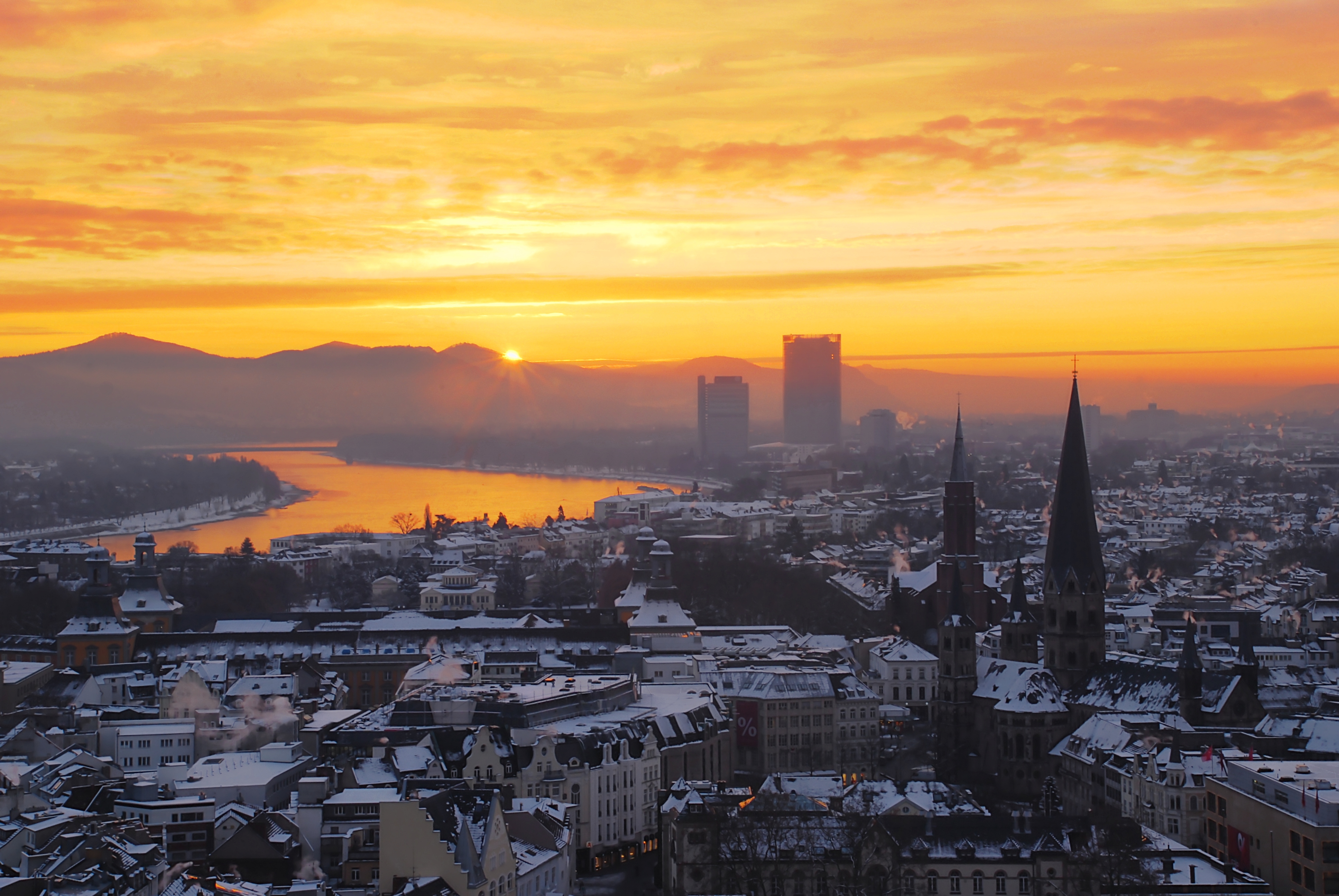
City which will be edited, used for the front cover
Tuesday, 11 February 2014
Week 2 - Template creation
Template ;
Creating the template
Colour mode -
I have decided to use the RGB (Red, Green, Blue) colour setting in which I will create my final image, it will then be switched to CMYK (Cyan, Magenta, Yellow, Black) because RGB is the preference for working on a computer display because the screen itself will display the colours differently -- whereas if i were to use CMYK the colours on screen will be distorted and will likely be also distored on print.
I also have decided to use 8 bit colour for the image, the reason for this is that it won't need to have a major colour depth and detail, whereas if i was creating images such as 3D images for a game or something similar I would choose 16 or 32 bit colour.
Resolution -
I have decided to use the 300 PPI (Pixels per inch) the standard for professional print, whereas I could use up to 600 PPI - I don't think that the image will need that much detail mainly because it's for a DVD cover but if it was for a full blown movie poster at a bus stop or in the cinema 600 PPI or higher will be required.
Background contents -
I have decided to use a transparent background content mainly because in the long run, it will make it easier to create the image and it won't crop the white background or any colour used into the proper image.
Image size -
I have looked into what sort of image sizes I should use and have come up with 280mm * 190mm (including bleed areas), with a width of 130mm for the cover page, 130mm for the back page and 14mm for the spine of the cover (not including bleed areas), and a height of 184mm for each part, the colours will extend out into the bleed area.
Bleed areas will be 3mm top, down, left and right, I think that this allocated size is perfect for the bleed area and minimises any chance of possible cropping.
The safety area will be allocated at 3mm for each side, i believe this to be necessary because I do not want to risk any future problems with printing or cropping.
Websites used for research ;
http://www.a1cds.co.uk/artwork/dvd-artwork-spec/dvd-cover-spec
http://uk.ask.com/question/what-are-the-dimensions-of-a-dvd-case
This is the final template, with a final moderate current image size of 21.2MB

Creating the template
Colour mode -
I have decided to use the RGB (Red, Green, Blue) colour setting in which I will create my final image, it will then be switched to CMYK (Cyan, Magenta, Yellow, Black) because RGB is the preference for working on a computer display because the screen itself will display the colours differently -- whereas if i were to use CMYK the colours on screen will be distorted and will likely be also distored on print.
I also have decided to use 8 bit colour for the image, the reason for this is that it won't need to have a major colour depth and detail, whereas if i was creating images such as 3D images for a game or something similar I would choose 16 or 32 bit colour.
Resolution -
I have decided to use the 300 PPI (Pixels per inch) the standard for professional print, whereas I could use up to 600 PPI - I don't think that the image will need that much detail mainly because it's for a DVD cover but if it was for a full blown movie poster at a bus stop or in the cinema 600 PPI or higher will be required.
Background contents -
I have decided to use a transparent background content mainly because in the long run, it will make it easier to create the image and it won't crop the white background or any colour used into the proper image.
Image size -
I have looked into what sort of image sizes I should use and have come up with 280mm * 190mm (including bleed areas), with a width of 130mm for the cover page, 130mm for the back page and 14mm for the spine of the cover (not including bleed areas), and a height of 184mm for each part, the colours will extend out into the bleed area.
Bleed areas will be 3mm top, down, left and right, I think that this allocated size is perfect for the bleed area and minimises any chance of possible cropping.
The safety area will be allocated at 3mm for each side, i believe this to be necessary because I do not want to risk any future problems with printing or cropping.
Websites used for research ;
http://www.a1cds.co.uk/artwork/dvd-artwork-spec/dvd-cover-spec
http://uk.ask.com/question/what-are-the-dimensions-of-a-dvd-case
This is the final template, with a final moderate current image size of 21.2MB
Sunday, 9 February 2014
Week 1 (Brainstorming)
Introduction:
Hello I am 1340539/1, and this blog will document the progression through the assignment for Digital Imaging Software, or DIS for short.
The ideas I come up with are inspired mainly by sci-fi films and games, such as the mass effect trilogy videogames, the star wars saga, but also inspired by books such as A song of fire and ice (Game of thrones) and it is likely that the final assignment will be based around something similar to this.
Brainstorm of ideas;
These are all brainstorms and aren't final ideas, just slight ideas to get myself on the right track
Film:
Bear driving an ice cream truck in space (horror)
Zombies in space (horror)
Batman vs. Predator (action / thriller)
Star wars : Episode VII
Videogame:
Half life 3 : Confirmed (action / adventure)
Sources of inspiration:
Bear driving an ice cream truck in space (film) ;
Mass effect (videogame)
Alien 1979 (film)
Borat 2006 (film)
The reason I have chosen a film like this to work around is that i find it incredibly funny to do and i know that i'll enjoy working on it, although it may not be a good idea to do something that i find funny because i might not take it seriously.
I also think that something like this will give many opportunities to use the array of photoshop tools and other editing software.
Zombies in space (film) ;
Dead space (videogame)
Biohazard (videogame)
Dawn of the dead 1978 (film)
The reason i am considering a film like this to work around is that there already are a lot of zombie films, so i wouldn't have any issue getting ideas for a trailer or cover case, although this idea is just standard and probably won't bring out the full potential of the tools i will be using.
Batman vs. Predator ;
Alien vs. Predator 2004 (film)
Batman (comics, games, films)
I am considering a film like this to work around because i am a huge fan of batman and the predator films, also the contrast of the two characters will work together and have a huge potential, such as a silhouette for the cover.
Star wars : Episode VII ;
Star wars saga 1977 - ? (Film, games, comics)
I honestly could not pass off an opportunity to do something like this, being a huge fan of star wars, although there already are a lot of fan pictures of the future films it will be difficult to come up with new ideas, the cover will likely be similar to the current films, etc.
Half life 3 : Confirmed ;
Half life 1, 2 (game)
The main reason i chose this was for a joke, half life 3 is a majorly anticipated game, and it's fan base are insane about it, spawning many discussions and jokes on the internet, i think it would be a good idea to follow this or something similar.
Conclusion;
Overall i think that my final decision will be either Batman vs. Predator or Star wars : Episode VII, in the next blog post i will detail my decision and why i chose, i will also research cover art for said decision and come up with possible implementations of ideas.
Hello I am 1340539/1, and this blog will document the progression through the assignment for Digital Imaging Software, or DIS for short.
The ideas I come up with are inspired mainly by sci-fi films and games, such as the mass effect trilogy videogames, the star wars saga, but also inspired by books such as A song of fire and ice (Game of thrones) and it is likely that the final assignment will be based around something similar to this.
Brainstorm of ideas;
These are all brainstorms and aren't final ideas, just slight ideas to get myself on the right track
Film:
Bear driving an ice cream truck in space (horror)
Zombies in space (horror)
Batman vs. Predator (action / thriller)
Star wars : Episode VII
Videogame:
Half life 3 : Confirmed (action / adventure)
Sources of inspiration:
Bear driving an ice cream truck in space (film) ;
Mass effect (videogame)
Alien 1979 (film)
Borat 2006 (film)
The reason I have chosen a film like this to work around is that i find it incredibly funny to do and i know that i'll enjoy working on it, although it may not be a good idea to do something that i find funny because i might not take it seriously.
I also think that something like this will give many opportunities to use the array of photoshop tools and other editing software.
Zombies in space (film) ;
Dead space (videogame)
Biohazard (videogame)
Dawn of the dead 1978 (film)
The reason i am considering a film like this to work around is that there already are a lot of zombie films, so i wouldn't have any issue getting ideas for a trailer or cover case, although this idea is just standard and probably won't bring out the full potential of the tools i will be using.
Batman vs. Predator ;
Alien vs. Predator 2004 (film)
Batman (comics, games, films)
I am considering a film like this to work around because i am a huge fan of batman and the predator films, also the contrast of the two characters will work together and have a huge potential, such as a silhouette for the cover.
Star wars : Episode VII ;
Star wars saga 1977 - ? (Film, games, comics)
I honestly could not pass off an opportunity to do something like this, being a huge fan of star wars, although there already are a lot of fan pictures of the future films it will be difficult to come up with new ideas, the cover will likely be similar to the current films, etc.
Half life 3 : Confirmed ;
Half life 1, 2 (game)
The main reason i chose this was for a joke, half life 3 is a majorly anticipated game, and it's fan base are insane about it, spawning many discussions and jokes on the internet, i think it would be a good idea to follow this or something similar.
Conclusion;
Overall i think that my final decision will be either Batman vs. Predator or Star wars : Episode VII, in the next blog post i will detail my decision and why i chose, i will also research cover art for said decision and come up with possible implementations of ideas.
Subscribe to:
Posts (Atom)